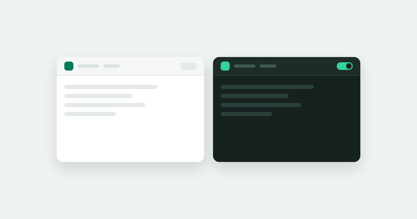
If your computer is set to dark, the site and the app now look like the rest of your screen instead of a floodlight.
The whole product follows the theme: the public pages, the signed-in screens, the report page and the code blocks inside it. There is a switcher in the header if you would rather choose than follow the system, and on a phone it sits beside the menu button where you can reach it.
A report can become a GitHub issue
GitHub joins Jira, Linear and Slack. Open a report, pick the destination, and it becomes an issue there - with the issue number shown on the report afterwards, so the two stay connected.
Jira issues now carry more than a link. What the report found - the failed requests, the console errors, the browser and screen it happened on - goes into the issue itself, so whoever picks it up in Jira can judge it without opening anything else.
If a repository or project refuses the create, the report says so in a sentence instead of failing quietly.
Nothing watches you use the product
Two changes, one intention.
Analytics used to run on every screen, including the ones where you read your own reports. It now runs only on the public marketing pages. What you do inside the product is not measured by anybody.
And the files the pages need are served from us rather than fetched from other companies while you browse. Opening a page no longer tells anyone else that you did.
Session Replay
Free Chrome extension. One click on the page that is misbehaving captures the screenshot, the console and the network log, and hands you a link to paste into the ticket.
Easier to read
Building the dark theme meant checking every colour that carries text, in both themes, and a run of small legibility problems came out of it: labels that were slightly too pale, initials in an avatar that were hard to make out, a selected price that did not stand out enough from the ones beside it.
None of it is dramatic. All of it is the kind of thing that quietly costs you a second every time you look at a screen.
Smaller things
- Your account avatar is visible at every window size, rather than disappearing on a narrow one.
- Signed in on a marketing page, the header has one menu instead of two.
- A pending email change is shown on your profile while it waits for you to confirm it, and asking for a fresh link cancels the old one instead of leaving both alive.
- The home page lets you pick who you are, so a developer and a support lead are not reading the same paragraph.