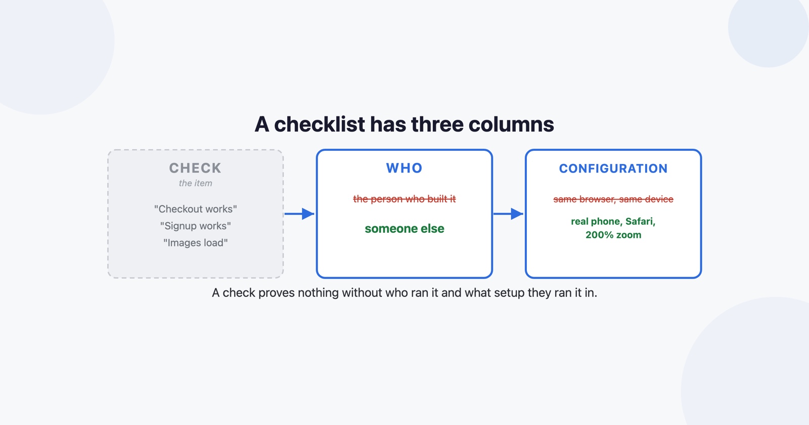
Most website QA checklists are a list of things to look at. Forms submit, links work, images load, it looks right on mobile. They are not wrong, and they catch almost nothing, because the hard part of pre-launch QA was never which items are on the list.
It is two other things. Who is doing the looking, and what configuration they are looking in.
The person who built it cannot see it
Ask the developer who built a page to check it works and they will check it works. They will click the thing they built in the order they built it, with the data they used while building, in the browser they had open.
That is not a criticism of them, it is a description of how knowing something works. They know which button is next. They know the form wants a date in that format. They know, without noticing that they know, that the thing on the left is a tab and not a heading. A first-time visitor knows none of it, and the checklist item “check the signup flow works” is answered honestly as yes by somebody who could not possibly experience it going wrong.
So the first column in a checklist that earns its place is not the item. It is who runs it, and for anything a stranger will touch, that should be somebody who did not build it. A colleague from another team, for fifteen minutes, finds a different set of things than the author finds in two hours.
“It works” is a claim about one configuration
The second column is the one checklists usually leave out entirely.
Your QA pass runs on one machine: one browser, one window size, one operating system, one set of settings, one network, one profile with your extensions in it. The site your visitors get is a different one. The same page is rendered by a different engine, at a different zoom, with dark mode forced on, with an extension injecting CSS, over a connection that drops.
Which is why “tested on Chrome” is a weaker statement than it sounds, and why the three engines matter more than the twenty browser names. A checklist that says “check the layout” is asking a question with no answer. One that says “check the layout at 200% zoom, and in a private window with no extensions” is asking two questions that each have one.
- Weak
- Check the checkout page works on mobile.
- Better
- Somebody who has not seen it completes a purchase on a real phone, in Safari, with the system text size turned up.
Use data shaped like production
The third thing, and the cheapest to fix. A QA pass run with Test User and test@example.com tests a site nobody will use. Production has names with apostrophes, addresses that run to four lines, accounts with nothing in them yet, and a list with eleven thousand rows in it.
Put four or five awkward records into whatever you are checking against, once, and keep them. Most layout bugs that reach customers are not in the layout. They are in an assumption about how long a string is.
The checklist
Three columns, and the two on the right are the ones doing the work. Keep it short enough that somebody will actually run it.
# Pre-launch QA: <what is shipping>

Each row: what is checked, who checks it, and in what configuration.
"Somebody else" means a person who did not build this.

| Check | Who | Configuration |
| --- | --- | --- |
| The main thing this release is for, start to finish | somebody else | a real phone, Safari |
| The same, on a desktop engine that is not Chromium | anybody | Firefox or Safari |
| Layout at 200% browser zoom | anybody | any desktop browser |
| The page with no extensions and no stored session | anybody | private window |
| Forms, with awkward data | somebody else | any |
| The empty state, with a new account | somebody else | any |
| The long state, with a large list | anybody | any |
| Keyboard only, no mouse, through the main flow | somebody else | any desktop browser |
| Dark mode, if the OS setting is honoured | anybody | OS set to dark |
| Anything the release notes claim | somebody else | any |

## Awkward data to keep around

- a name with an apostrophe and a name 80 characters long
- an account with nothing in it
- a list long enough to scroll for
- a value in a currency or date format that is not yours

## Not checked this time

Written down, one line. The point is that nobody later assumes it was.

## If something is wrong

Say what you were doing, what you saw, and in which of the configurations above.
A screenshot beats a description. Do not fix it in passing.
What the checklist cannot do
It is worth being honest about the ceiling, because a checklist invites the belief that finishing it means the site is correct.
Everything above is still one team, on a handful of configurations, on a day when nothing else is going wrong. The first week of real traffic will produce a set of failures that no pre-launch pass could have found: the browser you did not think of, the extension you have never installed, the network that times out halfway, the state nobody can reproduce because it depends on what the person did twenty minutes earlier.
Session Replay
Free Chrome extension. One click on the page that is misbehaving captures the screenshot, the console and the network log, and hands you a link to paste into the ticket.
So the thing worth shipping alongside the checklist is a way for those people to tell you, with enough attached that you are not starting from “it did not work”. That is the half a checklist structurally cannot cover, because it is about the configurations you did not know existed.
What to delete
On a small change, most of it. Three rows and a scope line is a real QA pass and takes ten minutes.
What never goes is the second and third columns. A checklist with only the first one is a list of things somebody will tick while looking at the version of the site that already works for them, which is the same as not running it. The test plan template is the document one layer out, and smoke testing is the five-minute version for when there is no time for any of this.